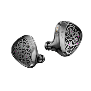
If you've visited our store or social channels recently, you may have noticed something different. Our avatar has changed. Our packaging is getting a refresh. And no — we haven't been hacked, we haven't sold the account, and we are absolutely not shutting down.
Instead, we're going through a major brand evolution. KeepHiFi has officially launched a fully redesigned logo.
01
A New Look, A New Chapter
From our earliest days, the original KeepHiFi logo — with its soft, rounded blue and yellow design — has been our identity. It was friendly, warm, and inviting. It represented a brand built for everyone who loves great sound.
02
Today, we're turning the page.
The new logo introduces a sharper, more hardcore geometric "K," rendered in clean black, white, and grey tones. It's a visual shift that reflects where we're heading as a brand: more precise, more professional, and more deeply rooted in the audiophile world.
We've changed our clothes. But we will never change our love for ultimate sound.
03
Why the Change? What Does It Mean?
Since the new logo went live, our inbox has been flooded with questions: Why the sudden change? What does the new "K" actually stand for?
We're keeping that under wraps for now. But rest assured — every line, every angle, and every facet of this new design was made with intention. The full story is coming soon, and we can't wait to share it with you.
04
What to Expect Next
We'll be launching a special promotion to mark the occasion — so keep an eye on our store and social channels.
For now, we just want you to get familiar with our new face. Don't mistake us for someone else!
Thank you for being part of the KeepHiFi journey. This is just the beginning.
We’re also hosting a gift card giveaway on X and Facebook; since they are two separate platforms, you can enter on both. Come give it a try!
— The KeepHiFi Team